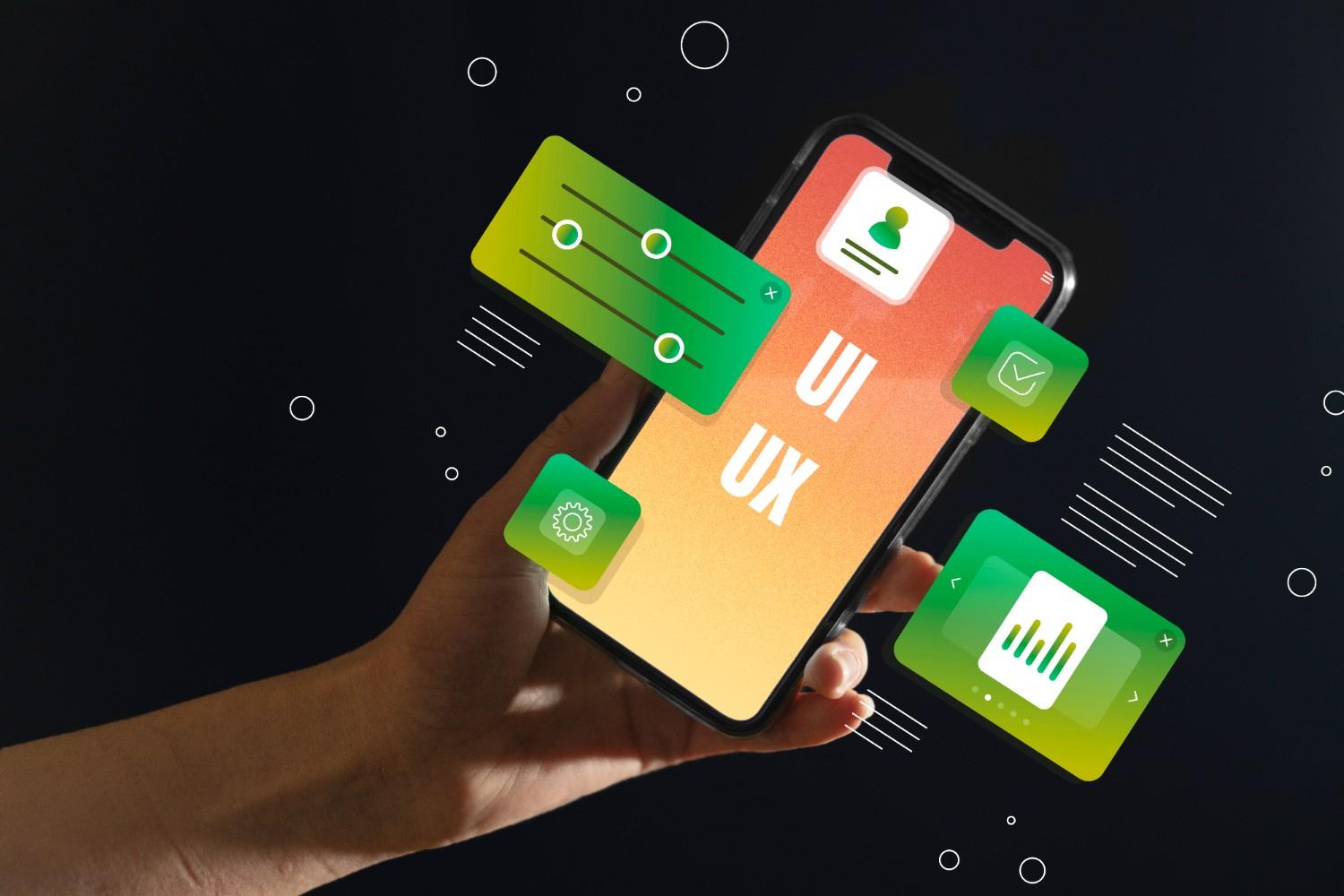
If you’re planning a new product or a redesign, understanding UX vs UI in mobile app development can make or break your roadmap. Put simply: UI is the screen you touch; UX is the experience you feel before, during, and after that touch. Both are essential—and different.
What Does “UX vs UI in Mobile App Development” Actually Mean?
User Experience (UX) is the end-to-end journey—researching user needs, mapping flows, structuring information, and validating with testing so the product solves real problems with minimal friction. User Interface (UI) is the visual and interactive layer—layout, typography, color, motion, components, and states that make interactions clear and delightful. In short, UX decides what to build and why; UI determines how it looks and behaves on screen.
A simple split that teams align on
- UX outputs: research insights, journey maps, IA, wireframes, prototypes, and test reports.
- UI outputs: component specs, high-fidelity screens, micro-interactions, motion rules, and design tokens.
Why Both Matter for Adoption, Retention, and Reviews
Mobile users abandon slow, confusing, or visually inconsistent experiences. Strong UX reduces cognitive load and task time; strong UI improves clarity, trust, and brand feel. Leading references emphasize that UI is not UX—great visuals can’t rescue a broken flow, and perfect flows won’t shine with messy visuals. Teams that pair both disciplines typically ship apps that are usable, useful, and memorable.
UX vs UI Responsibilities Across a Mobile Sprint

Discovery & Strategy (UX-led with UI partnership)
- Run user interviews, surveys, and competitive audits to define problems and success metrics.
- Translate insights into personas, jobs-to-be-done, and prioritized use cases.
- Create user flows and low-fi wireframes to validate navigation and layout before pixels.
Interaction & Visual Design (UI-led with UX guardrails)
- Establish design tokens (color, type scale, spacing, elevation) and component libraries for consistency.
- Design stateful components (loading, error, empty, success) and motion that supports comprehension.
- Ensure contrast, hit targets, and platform conventions (Material/iOS HIG) are respected.
Validation & Iteration (UX + UI together)
- Usability tests on key flows (onboarding, paywall, checkout) with success criteria.
- Heuristic reviews to catch issues like visibility of system status, consistency, and error prevention.
- Analytics instrumentation to close the loop on design assumptions.
UX vs UI Deliverables You Can Expect
- From UX: research plan & findings, journey maps, information architecture, wireframes, prototypes, test reports.
- From UI: high-fidelity mockups, component specs, motion guidelines, redlines, assets, and a shared design system.
How to Prioritize UX and UI in Your Roadmap
- Anchor to the core job first. Validate the key task (e.g., book a ride, split a bill) with quick UX prototypes; don’t jump straight to color palettes.
- Invest in a minimal design system early. Even a tiny token set prevents drift and accelerates delivery as screens scale.
- Time-box discovery, not learning. Keep lightweight research continuous—ship, learn, refine.
Common Pitfalls (and Better Practices)
- Pitfall: Treating UI polish as a “phase 2” add-on.
Fix: Design tokens and component guidelines from day one to avoid rework. - Pitfall: Confusing preference with evidence.
Fix: Validate with usability tests and heuristics rather than internal opinions. - Pitfall: Skipping device realities.
Fix: Design for thumbs, one-hand use, network slowness, and varying screen sizes with adaptive layouts.
Frequently Asked Questions
1. What is the main difference between UX and UI in mobile apps?
UX is the holistic experience—understanding user needs, structuring flows, and validating solutions. UI is the look and interactive feel—components, layout, and motion on the screen. You need both: UX ensures usefulness; UI ensures usability and appeal.
2. Which should I prioritize first: UX or UI?
Start with UX to confirm the right problem and flow, then apply UI to communicate hierarchy, affordances, and brand. Skipping UX often leads to beautiful interfaces that users abandon because the journey doesn’t work.
3. How do I measure whether UX or UI changes worked?
Combine qualitative (usability tests, task success, time on task) and quantitative (activation, funnel drop-offs, retention, CSAT) signals. Heuristic reviews and A/B tests complement field studies for a fuller picture.
4. Can one designer handle both UX and UI?
Many designers are T-shaped and operate across both, but complexity scales fast. Teams often split roles to move faster and maintain quality—UX leads the research and flow; UI leads the system, micro-interactions, and visual craft.
The Bottom Line (and Your Next Step)
A winning mobile product treats UX vs UI in mobile app development as a partnership: UX nails the problem and the path; UI earns trust, speeds comprehension, and adds delight. When you align both from discovery through handoff and iteration, you ship apps that people not only try—but keep.