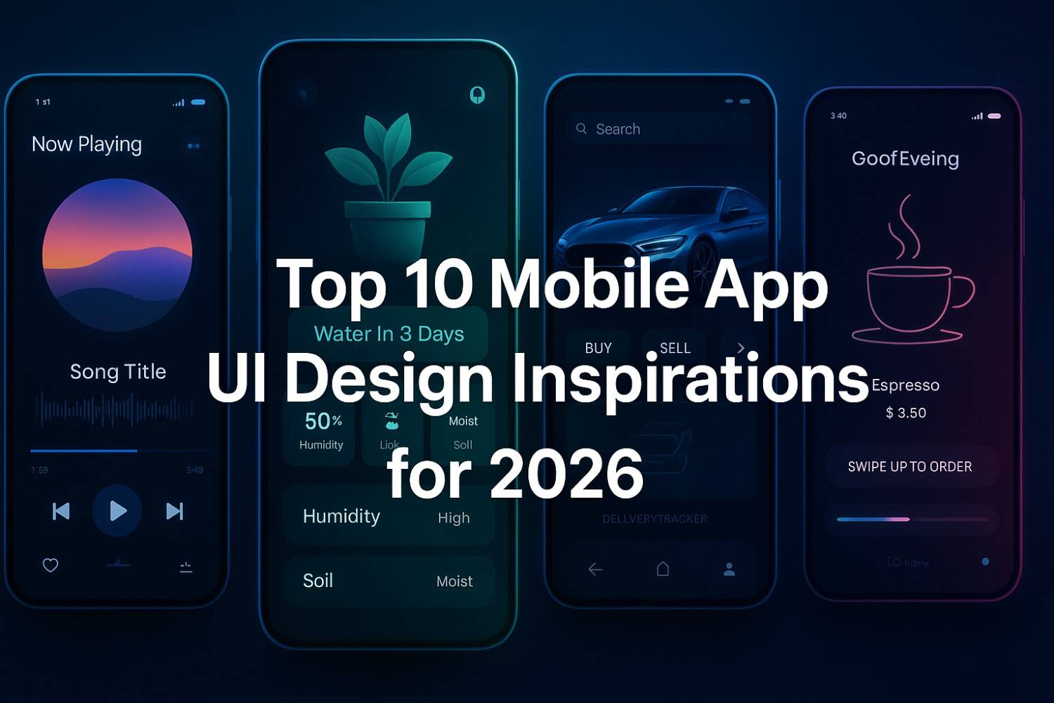
With over 6,000 new mobile apps hitting the Google Play Store and Apple App Store every single day, you’ve got milliseconds to make an impression. Users today are savvier, pickier, and more likely to ghost your app than ever before if it doesn’t dazzle them from the jump.
First impressions matter more than ever—and what makes that first impression? Your app’s user interface (UI). Design isn’t just about making something look pretty—it’s about usability, experience, vibe, and flow. In 2025, mobile UI design isn’t just functional; it’s expressive, inclusive, and intuitive.
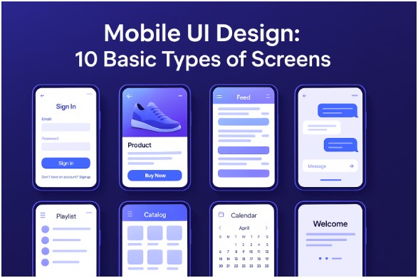
So if you’re diving into app design or looking to revamp your existing one, here are 10 essential screens to get right, along with fresh 2025 insights to help you stand out.
Mobile UI Design 10 Basic Types of App Screens
1. The Log-In & Profile Screen
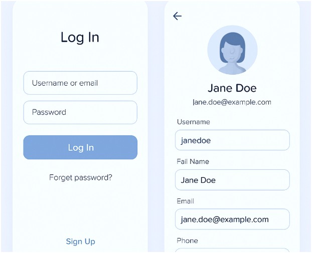
Still the gatekeeper of your app experience, this screen sets the tone. A cluttered or frustrating login process? Instant uninstall.
2025 Tips:
- Offer biometric login (face/fingerprint) as a default.
- Include sign-in options using popular SSO providers like Google, Apple, or Microsoft.
- Use motion design—micro-animations that confirm successful input.
- Dark mode by default. Enough said.
Design this screen to reflect the personality of your brand. Want playful? Go vibrant. Want minimalist? Keep it cool with whites, grays, and calm accent tones.
2. The Product Screen (aka: Make It Shine!)
Whether you’re selling shoes, software, or subscriptions, this screen showcases your stuff.
2025 Tips:
- Use high-res images with 360° viewing or AR try-on features.
- Include collapsible sections for reviews, specs, and related items.
- Keep CTAs (like “Buy Now”) bold, clear, and thumb-friendly.
- Visual hierarchy is key. The product image should own this space.
Remember: a product page that looks messy or overloaded will kill conversions.
3. Playlist Screen (More Than Just a List)
Ideal for music, video, podcast, or content-based apps. This screen is about organization and mood.
2025 Tips:
- Offer personalization (“Recommended for You”) on playlists.
- Support gesture controls: swipe to play, long press to queue, drag to reorder.
- Use album art and dynamic waveforms or visualizers to engage.
Bonus: Animate transitions between tracks for a smoother, immersive experience.
4. The Catalog Screen (Grid it, List it, Sort it!)
Your catalog is your storefront. This screen should help users browse effortlessly.
2025 Tips:
- Use card-based layouts with responsive grids.
- Filter and sort options should feel natural—not hidden behind confusing icons.
- Add infinite scroll or smart pagination for performance.
- Ensure loading states are animated and fun (skeleton loaders are a vibe).
Data-heavy? Use AI to prioritize products based on user behavior.
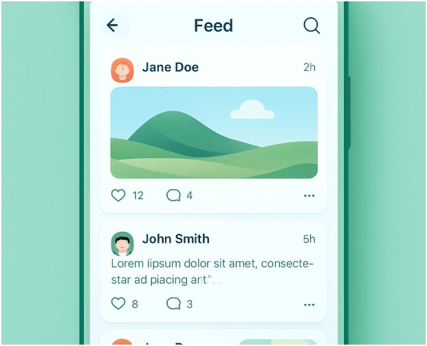
5. Feed Screen (Keep It Fresh)
Social media, news, updates—whatever the feed, it needs to be scroll-worthy.
2025 Tips:
- Include auto-refresh with a smart prompt (“New posts available”).
- Integrate voice notes, reactions, and video in-feed.
- Use subtle parallax effects or motion to add depth.
Keep visual clutter low. Let your content do the talking.
6. Calendar Screen (Make Life Easier)
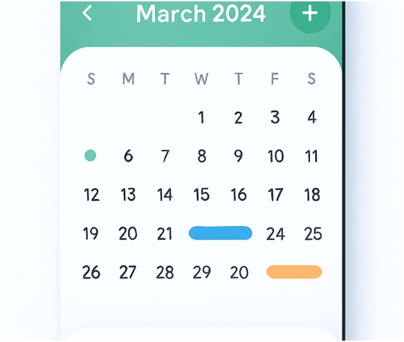
People juggle work, life, deadlines, and drama—help them stay on top.
2025 Tips:
- Integrate AI-assisted suggestions for time-blocking.
- Use color-coded tags and agenda-based views.
- Enable drag-and-drop for rescheduling.
- Add collaborative features like shared calendars and team visibility.
This isn’t just for productivity apps—fitness, education, events all benefit from clean calendar integration.
7. Splash Screen (First Look, Big Impact)
It’s quick, it’s subtle, but it matters. A well-designed splash screen sets the tone.
2025 Tips:
- Keep it under 5 seconds, or risk annoying your user.
- Use lightweight animations or logo reveals.
- Add sound sparingly—useful for gaming or music apps.
A splash screen shouldn’t feel like waiting in line. It should feel like being welcomed in.
8. Home Screen (Navigation HQ)
This is your user’s launchpad. Everything else stems from here.
2025 Tips:
- Keep primary actions within thumb’s reach (bottom nav > top tabs).
- Use cards, icons, or tiles for visual hierarchy.
- Add a search bar with smart autocomplete and voice input.
- Personalize! Use the user’s name, preferences, or dynamic greetings.
No two users use an app exactly the same—so let this screen evolve based on their behavior.
9. Conversational Screen (The Future Is Chatty)
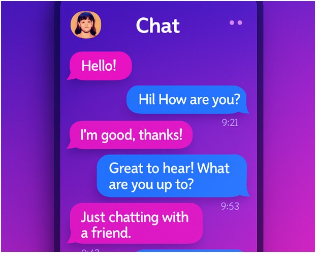
Whether it’s a chatbot, support center, or AI assistant, conversation-driven UIs are booming.
2025 Tips:
- Enable hybrid text and voice input.
- Add personality! Don’t just be a robotic responder.
- Support inline actions like booking, canceling, confirming.
- Let users rate interactions or save chats for later.
Bonus: Emojis, GIFs, and reactions make the interface feel alive.
10. Onboarding & Offboarding Screens
The start and end of your user journey—don’t sleep on them.
2025 Tips:
- For onboarding, use short swipeable tutorials with clear benefits.
- Allow users to skip—but reward them for finishing.
- Use progress indicators, motivational nudges, and contextual tips.
- For offboarding (when a user logs out, deletes, or exits), offer feedback options, re-engagement promos, or heartfelt goodbyes.
Sometimes, it’s not goodbye—it’s just “see you soon.”
Slay That First Impression (And Every One After)
Let’s be real—your app is one swipe away from being deleted if it doesn’t connect, perform, and look good doing it. The best apps of 2025 understand that UI is more than skin-deep—it’s about telling a story, guiding a journey, and making a digital experience feel truly human.
From the moment a user opens your app to the moment they (hopefully never) leave, every screen matters. So keep it crisp, keep it clean, and above all—keep it you.
Because in this crowded app world, standing out isn’t optional—it’s survival.
Now go forth, design fearlessly, and remember: even the smallest button can spark the biggest delight.